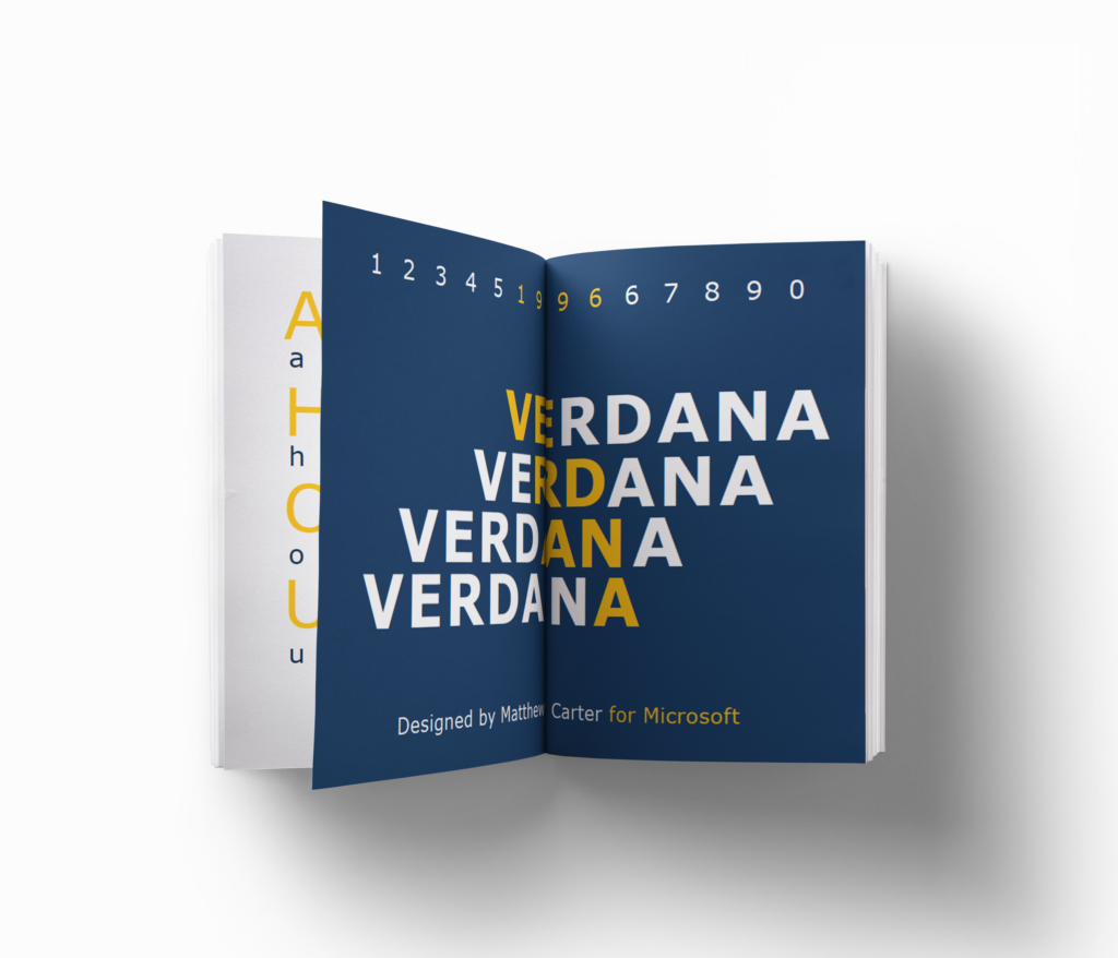
In the world of brochure printing, fonts play a crucial role in determining the effectiveness and appeal of your communication. The right font choice can make your brochure visually engaging, easy to read, and convey the intended message accurately. Let’s delve into the ultimate guide for selecting the best fonts for your brochures.
I. Understanding Font Styles and Categories
Serif fonts have small lines or flourishes at the ends of the main strokes of each character. These fonts, such as Times New Roman and Garamond, exude a classic and traditional look. They are often associated with a sense of formality and are suitable for brochures in industries like law, finance, or education. The serifs can guide the eye along the lines of text, making them more readable in longer passages of text.
Sans-serif fonts, on the other hand, lack these decorative strokes. Examples include Arial and Helvetica. They have a clean, modern, and minimalist appearance. Sans-serif fonts are preferred in brochures where a contemporary and straightforward message is needed, such as in technology or fashion. They work well for headings and shorter blocks of text, providing a sharp and clear visual impact.
Script fonts imitate handwritten or cursive styles and add an elegant and personal touch. However, they should be used sparingly as they can be difficult to read in large amounts of text. They are ideal for adding a touch of sophistication to invitations or special sections of a brochure.
Decorative fonts come in a wide range of styles, from playful to elaborate. While they can be visually striking, they need to be used with caution. Overusing decorative fonts can make the brochure look cluttered and unprofessional. These fonts are best used for emphasizing key words or creating a unique title.
II. Considerations for Brochure Font Selection
Readability is paramount. Choose a font size that is large enough to be easily read, especially for important information. A good rule of thumb is to use at least 10-point font for body text and a larger size for headings. Line spacing also affects readability; too little space can make the text look crowded, while too much can make it seem disconnected. Aim for a line spacing of 1.5 to 2 times the font size.

The font should align with your brand’s personality and the tone of the brochure. If your brand is fun and youthful, a bold, colorful sans-serif font might be appropriate. For a more sophisticated and established brand, a classic serif font could convey the right image. The font choice should enhance the message and emotion you want to convey. For example, a soft and rounded font can create a friendly and approachable feel, while a sharp and angular font can imply strength and modernity.
Understanding your audience and the purpose of the brochure is essential. If the brochure is aimed at an older demographic, larger fonts and more traditional styles might be preferred. For a younger audience, more modern and trendy fonts could capture their attention. Business brochures may lean towards professional and conservative fonts, while creative or artistic brochures have more leeway for experimentation.
It’s important to ensure compatibility and consistency when using multiple fonts. Generally, it’s best to limit the number of fonts to two or three to avoid a chaotic look. Choose fonts that complement each other in style and size. Use one font for headings and another for body text to create a clear visual hierarchy. Consistency in font usage throughout the brochure helps maintain a professional and polished appearance.
III. Popular Fonts for Brochure Printing
Some classic and timeless fonts that work well in brochures include Bodoni, which is known for its elegance and readability, and Palatino, which offers a balance of formality and warmth. Modern and trendy options like Montserrat and Proxima Nova are popular for their clean lines and contemporary appeal. Industry-specific preferences also exist. In the healthcare industry, fonts like Roboto or Open Sans are often used for their clarity and simplicity.

IV. Tips for Font Pairing
When pairing fonts, aim for contrast in style. For example, combine a serif font with a sans-serif font to create visual interest. Use a bold or larger font for headings to draw attention and a smaller, more subdued font for the body text. This helps establish a clear visual hierarchy and makes it easy for readers to navigate the brochure. Be careful not to use fonts that are too similar, as this can make the distinction between headings and body text less obvious.
V. Testing and Proofing
Before finalizing your font choices, it’s crucial to print samples of your brochure. This allows you to see how the fonts look in physical form and make any necessary adjustments. Also, view the digital version of the brochure on different devices and screen sizes to ensure the readability remains intact. Check for any legibility issues, such as letters running together or text that appears too small.
VI. Conclusion
Choosing the best fonts for brochure printing is a combination of art and science. It requires an understanding of different font styles, consideration of various factors such as readability, brand image, and audience, and the skill to pair fonts effectively. By making informed font choices and testing them thoroughly, you can create a brochure that not only looks beautiful but also communicates your message clearly and professionally. Remember, the fonts you select are an integral part of the overall design and can significantly impact the success of your brochure.
In conclusion, take the time to explore different font options, keep your target audience and message in mind, and don’t be afraid to seek inspiration from other successful brochures. With the right font choices, your brochure will stand out and leave a lasting impression on your readers.